Showing posts with label blue and red wedding. Show all posts

Monday, 19 April 2010

Blue, Red & Silver - Wowzers!

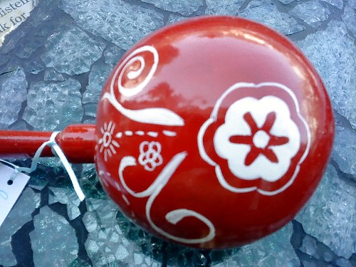
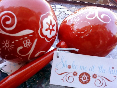
The biggest CONGRATS goes to Elizabeth who tied the Knot at Dreams this past Saturday! I absolutely LOVE her colors and can't wait to see the day of photos! She wanted something styled after Nikki's maracas pictured down below but in her colors of tiffany blue, red and touches of silver....This time, the artists were Israel and my hubby, Antonio - and I think they did a fab job (even if I am slightly biased - I'm a hard task master for detail - just ask them ;) ....

We have a bunch of maracas coming-up next week .... I do try to not post the maracas before the bride has seen them, so we might be a bit delayed .... and I may have to post Mariah's wedding photos without some of the details, as it's taken a big longer with Paulina than we thought it would - this time of year is just a MAD RUSH!

Thursday, 4 June 2009

Elegant Beachside Wedding!

Well, the 2008/2009 wedding season has come to a close and we ended it on a wonderful high note! This bride and groom were so awesome to work with and so very gracious and the biggest shout out goes to Britt & Aaron who were married last Saturday at Dreams!


Britt is training to be an architect, so she had a very fine eye for detail and a real passion for textures - we exchanged over 180 emails over the course of 9 months! What made working with Britt so much fun was her passion for all of the above, yet a complete willingness to let me work organically, the way I work best, and because of that I was able to really create something fun and unique!


THE INVITE

Britt's invites were super cool - unfortunately, I don't have the complete invite she sent me because I had to give pieces of it away here and there (to Memo from Charme for the color of the cake, to the owner of our arts and craft store for the color of the ribbon, etc.!) but the first photo was the invite idea and the scanned photo was the actual invite. Her actual invite came in a really awesome transparent envelope with the same red coral design, super cool!


THE DESIGN BOARD

This was the design board I worked off of to find the materials I needed for their design. Some were pictures Britt had sent me, or selected from our private online gallery or things I'd found on the internet after I understood the look and feel Britt was going for. Her colors were acqua blue, white and touches of red and silver (although her bridesmaid's wore mango!).


THE BOUQUETS

Knowing how much Britt loved texture and had requested flowers a little different than the norm, I made her bouquet with red anthuriums, red peonies, red roses and berries. Each of her bridesmaids had a different bouquet - some with white anthuriums, some with orchids and calla lillies, some with white roses and delphiniums, mums, tuberose, ranunculus - you get the idea! I wanted a peek of color in the wraps to represent the touches that were in the wedding. I'm quite happy with the result! :)


THE CEREMONY

We wanted to keep the ceremony fairly simple, to really emphasize the beautiful ocean and beach and the rocky enclave in the background. Britt & Aaron wisely chose silver chiavari chairs. We had a white petal ceremony aisle and then edged that with gerbers, as Aaron's favorite flower were daisies! Britt had first requested palm frond fans but I told her I think we could do something even better and I do believe Omar created something super beautiful with the red fans and white bird/sunset cut-outs! A whole head of a rose was encased in acqua blue netting for rose petal throwing later and Britt requested some reserved seating, so we created signs based on her invite.


SHOES OPTIONAL

At the end of the wooden walkway, we set-up a washing feet area, complete with citrus scented water which we had put ice in earlier in the day to make sure that guests could cool down. Chocolate brown pitchers accented in blue were set nearby to pour water and a basket if towels in white and acqua blue were set nearby to dry. The area was also decorated with tuberose, white roses and delphiniums.


GUEST WISHES AND COCKTAIL


Guests made their way to the Gazebo where 4 cocktail tables draped in acqua chiffon and tied with red ribbon were waiting along with platters of cheeses. Tucked in the corner was a sign for Guest Wishes and little cards for guests to fill-out. I wanted to do something entirely different, so the cards requested that the guests choose a date they would like the couple to comply with their wish (hopefully something romantic!) ... the guests then sealed the cards with a silver sticker and dropped into a bowl filled with orchids and coral.


TEQUILA TASTING LOUNGE

In one corner of the transparent tent (in case it rained and also for the dance floor, which we are getting to!) we set-up a lounge area with 4 of the most popular tequilas. Talavera shot glasses were on display for drinking and doubled as favors. Signs were created to explain the different kinds of tequila, so guests would have some background information. I had already bought the fabric when Britt wrote and asked me to please not make the pillows matchy matchy, which made me laugh as I promised her I wouldn't ;). White pillows were decorated with mother of pearl beads, red and white wavy lines represented a touch of red (and in keeping with the bride's love of the idea of waves without incorporating something beachy) and my favorite pillows had acqua netting over white with red birds - a nod to the bride's invite which had two birds on the back. There were also silver textured vases and acqua painted blue candles!


THE RECEPTION

We covered the tables with acqua chiffon and placed silver napkins accented with red ribbon and mother of pearl - also doubling as necklace favors which guests donned later in the evening. Glass vases filled with coral and exotic red flowers (anthuriums, ginger, roses, heliconia, etc.) and, in-between, hand-painted vases with different scenes of red birds, coral, and sunsets. Placecards were modeled after RSVP's which had a sunset and wavy lines representing the ocean with guest's names and where they were from.


THE DANCE FLOOR

My absolute favorite was the dance floor .... Britt wanted guests to have the feeling of dancing under the ocean so we created an area with hanging orchids, roses and casablancas with cracked glass vases and a white fringe chandelier decorated with sparkling crystals. I think the pictures really speak for themselves.


THE CAKE

Again, copying the idea of waves with the blue and white lines in the cake, off-set with orchids and hand-created red birds swooping along. It also happened to be delicious (I got a little piece!).


A SPECIAL SURPRISE

When I'm creating, I come up with all kinds of questions - some of which the answers are incorporated into the design. When I read Britt's response to my question as to how she and Aaron had their first date, I could tell that it was a very, very magical moment for her. So, I asked Britt to have Aaron please send me his version of their first date - which involved Aaron making sundaes for her and her sister. I then created a little card in their words about their first date and asked Dreams if they could also send out chocolate sundaes along with the cake when it was cut and the little card. Well, it happened even better than I imagined because, right before they cut the cake, Britt's sister gave her toast - and it was ALL about their first date and the sundaes Aaron had made! As she was talking, waiters were bringing out the sundaes - I would love to say I had orchestrated that, but it was truly fate! When guests returned to their tables, they found the cake, the sundaes and the cards. The expression on Britt's and Aaron's faces when they say the surprise made that the cherry on top of a beautiful night!


BEAUTIFUL NIGHT


THE BOSS

Now you know who the "real" brains of this operation is! ;)


I have a few more maraca orders to show you and then it's back to design inspirations all summer long before the start of the 2009/2010 wedding season which looks like it will be a really good one!

Monday, 27 April 2009

Yeah for the Red, Orange and Teal!

I bet you thought this post would never come! I was starting to wonder myself ... well, here it is. I know the color is officially "teal" but some of the blues in this post are - well, not exactly teal - so use your imagination!
PRINTED MATERIALS
This was one thing there was a plethora of in this color combo. On the far left we have orange menu on orange napkin on top of blue glass plate (The Knot); next I'm not sure what these were used for but I think they could make some really great invites (Elizabeth Anne Designs); and at the end of this row I LOVE this orange flower combo with blue ink printed menu - very chic! (Tastefully Entertaining). Next row we have these blue and white whimsical flowers which I heart (J Creations) and this way bold/modern red/teal invite from Pink Lily Press.
The two patterns (in blue and fuchsia and olive and orange) are from Paper Laces. I know this box and napkin really could have been under favors or something like that and, while love the combo, also really loved the print (even if it's small and hard to see - you get the idea!) found at Project Wedding. I heart heart the last invite on this row - I love the blue design, large orange flower and the texture - super amazing! (Tastefully Entertaining). I think the word overlay on top of this orange invite is also a pretty swell idea (Tanger Greetings); teal monograms still very hip (Pink Design Events). Really pretty blue cards (The Knot); of course am always a big fan of swirls and dips and curlies (E Bride Connect); great large orange flower invite (Pink Lily Press) and last, but never least, I love when there are combos - when a design is taken and there are elements of that design but not the exact design and I think this invite set really captures that (Favor Ideas)!!

CENTERS and BOUQUETS
This was not an easy color combination to find good photos - which is always fun to me to actually create IRL, because you know you're doing something a wee bit out of the ordinary! I imagine this first photo (Grand Tradition Estate) with teal napkins and teal wine glasses! Can you see it?!! Favor boxes are next and, while not a big fan of fake flowers (actually no fan at all), I actually do see the beauty in this idea (Budget Dream Weddings). I really like this bouquet - I like the greenery combined with the orange roses and the red berries. Add a teal wrap and, wa-la, awesome! (Wedding Bouquets). At bottom we have blue glasses with orange flowers for centerpieces (add some red flowers for a bit more spice!) at E Bride Connect. Very interesting red roses/feather center - in a teal box with some orange accents would be quite striking (Project Wedding). And lastly this is a great shades of orange bouquet which could quite easily have some red accents and still get the same effect (The Knot).

CAKES
By now I'm sure you know how much I HEART cakes! I do realize this white cake isn't blue, orange OR teal, but I love the accent of white throw in there with all that color and I love this cake and it's my blog, so there! ;) (Tastefully Entertaining). Next we have this really unique blue and red cake (add a strip of orange ribbon and all your colors are there!) (Pink Cake Box). At bottom we have a very interesting blue with orange textured/patterned cake (E Bride Connect) and lastly, teal and chocolate brown (which could very easily be teal and red with an orange overlay on the cake table) from Favor Ideas.

KEWL STUFF
Okay, so I admit I've been stumbling over myself to get to this design board! I can't really define why but I heart heart these shoes with a wedding dress - it's just a fantastic touch (The Knot). I hesitate to put this because I don't like putting in things that we probably can't get here in Vallarta, but pic and idea is fab - I love boxes of all kinds and I think this retro blue box is awesome and I would love to get that as a favor at a wedding! (Once Wed) Ya'all know I love wraps and this one is no exception (Elizabeth Anne Designs). This invite is just "wow" - imagine teal where it's gray and red stones where there are white stones (haha! this is how I think all the time!) (Social Frog)... Of course blue fans rock - especially if they had a red design painted on them! (The Knot) Blue china is just awesome - can be done here, but expensive (Kim Vallee); up above we have this great blue/orange flower garter (Project Wedding) and underneath these stamps - heart heart heart! (Zazzle) Lastly, love sassy bridesmaids with great blue dresses, red bouquets and red shoes! (Project Wedding)

Next week might be tackling hair, believe it or not - not something I get asked about often, but love anyway .... OR I might share some sneak peeks of one of the wedding designs that has kept me from posting :).

Tuesday, 27 January 2009

2 Pesos - Stamps Can be Marvelous Things!

A big shout out goes to K8 who tied the knot last Friday! I wanted to go but I had a teething baby to contend with and, just like the rest of you, must wait for wedding photos.... but, meanwhile, here is a little preview of a few little goodies we put together for her....

Kate wanted something that was romantic but distinctive to go along with her aqua/red motif so I went searching the internet for inspiration and I gave Kate her choice of various designs. This is the one she chose...


Kate's Design Inspiration

As fate would have it, she had a girlfriend who actually owned this stamp! So, she was able to have her friend make welcome bag tags and ceremony programs using the stamp motif. They looked like this:


Stamped Ceremony Programs and Tags
(not done by us but super kewl anyway!)


I had the task of making the stamp into a useable graphic which was a fun challenge! I erased and colored away and put touches of the stamp into her menus, place cards and shake me tags for her maracas. They looked like this...


Menus


Place Cards

Shake Me Tags!

And, finallly, Omar and I discussed what would look best and came-up with the following design which I think really takes the cake! He's so crazy talented!!


Maracas


Next week will be a full on blog on the color scheme of red, orange and teal, submitted by a BDW bride!

Wednesday, 15 October 2008

Shades of Blue and Cherry Reds!

Well, I got it all backwards! I thought orange and blue would be hard and red and blues would be easy - I couldn't have been further from the truth! But the goodies I did find are quite the catch!! Without further ado....

INSPIRATION BOARD

Most of these photos will show-up again - I just wanted to put a little something together to show you the beauty of this color combination from some of my favorite shots. The one picture that won't show-up later is the beautiful floral inspiration in the upper left corner which I found at Wedding Poop Blogspot (no, I DID NOT make that up - go there and see!).


INVITES, ESCORT/PLACE CARD/TABLE MARKER INSPIRED

In the upper left hand corner we have the pretty embossed invite version I found at the ever famous Project Wedding. Next to that I love the bold, modern yet fanciful twist of this handmade invite over at Etsy. These interesting word cut-out handmade invites were also found at Etsy by AmyZo. Next to that is the more reserved, yet elegant invite at Budget Dream Weddings. Underneath I love the way this invite is wrapped with the pretty red floral graphic done at Project Wedding. This more flamboyant invite was actually an invite to a museum auction but I thought it would look great as a wedding invite for the right bride and groom and found at Paper Style. And, over at Perfect Memories Events Blogspot, I found this whimsical red and blue circle invite.


CENTERPIECES

I didn't find a lot, but what I did find I love! First up is this delightful centerpiece collage in the upper left-hand corner, found at Brides. I love the cut-out metal floral vase paired with blue candles and red accents - now, I'll admit, not an easy look to achieve here in Vallarta - but not impossible! What I adore in the next photo is all upwards - I love what appears to me strung red flowers and the pretty light blue Chinese lanterns - so whimsical yet dramatic! The reason I don't love the table scape as much is I would love to see some sort of touch on the white covered chairs - I'm not a fan of the white-covered chair but do think they can be incorporated fairly well if there is some sort of accent-action going on. Anywho, I found that photo at Life, Love and Lipstick.


In the middle row is the larger version of the centerpiece I love mentioned up above. Next to it is a more breezy, beachy idea which was found at I-Weddings. Of course, this photo is missing the blue accent - what I would have loved to see is the white vases replaced with blue vases - then I think this photo has the possibility of fabulousness!


In the bottom row, these pretty, light and airy vases filled with red buds was found at Flickr. Next to it we have an aqua and blue affair found at Wedding Bee. And lastly, but not leastly, beautiful blue wrapped vases filled with luscious red flowers at Project Wedding.


BOUQUETS, ACCENTS, ETC.
Well, I didn't find enough of each of these to make them their own collage, but I did find pieces of all to create this one! Upper left-hand corner is a full-blossomed bouquet at Brides. Next to it are these wonderful blue-inked ceremony programs done by Hy Studio. I found a few bird inspired pieces - enough that I might just do a whole blog on them! These bird favors and the bird coasters underneath were found on Flickr. I've used bird cages before, but I really love the ornateness of this birdcage in particular which I also found at Flickr.


Underneath the red bouquet are my favorite favors - little metal photo frames which doubled as escort cards at I-Weddings. Underneath we have cute Mr. and Mrs. chairs at Hy Studio, little favor food boxes (yum yum!) also at I-Weddings, and I adore this monogrammed dance floor at Wedding By Color.


Again, blue lanterns which I've mentioned before but love them, so here they are again, at Flickr/OnceWed. Little collection of favor items (like matchbooks, retro pins, etc.) over at Brilliant Event Planning. Beautiful, elegant blue laced pillow at Once Wed. I know I almost never get consulted re: bridesmaid dresses, but I love the color of this blue and the look of these found at Bon Mariage. Snazzy blue boxes with bright red flowers found at Flickr. This memory space with antique candle holders, red candles, red flowers and blue foto frame at I-Weddings. And this ceremony program idea was also found over at Flickr.


MISHKA DESIGNS' TWISTS
We didn't have time to do an example of a blue/red favor as Omar is working on some upcoming projects, but I clumsily tried to do a photoshop example from our maraca/fan examples earlier to hopefully just give you an idea of what you could do (with our help, of course!)!!


Mid-month will find us focusing-in on a requested color palette of lime, red and chocolate brown - should be interesting!! If you're a bride or a coordinator and would like a blog on something for your upcoming wedding, drop me a note!!
 
Designed by Visión Mandarina